Stay Up to Date on All Things AmpliFi
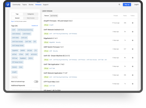
Firmware Releases
Find early access, web, and mobile updates for your AmpliFi products.
Visit Our Releases Page
Official AmpliFi Community
Connect with other AmpliFi users, discuss deployments, compare configurations, and more!
Visit Our Facebook Group